| Chapter 3. First steps with Wilber | ||
|---|---|---|
 |
Part I. Getting started with the GIMP |  |
| Chapter 3. First steps with Wilber | ||
|---|---|---|
| |
Part I. Getting started with the GIMP | |
Table of Contents
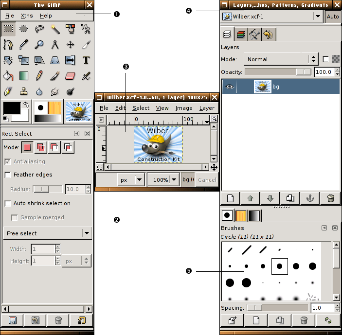
The screenshot above shows the most basic arrangement of GIMP windows that can be used effectively. Three windows are shown:

|
The Main Toolbox: This is the heart of the GIMP. It contains the highest level menu, plus a set of icon buttons that can be used to select tools, and more. |

|
Tool options: Docked below the main Toolbox is a Tool Options dialog, showing options for the currently selected tool (in this case, the Rectangle Select tool). |

|
An image window: Each image open in GIMP is displayed in a separate window. Many images can be open at the same time: the limit is set only by the amount of system resources. It is possible to run GIMP without having any images open, but there are not very many useful things to do then. |

|
Layers Dialog: This dialog window shows the layer structure of the currently active image, and allows it to be manipulated in a variety of ways. It is possible to do a few very basic things without using the Layers dialog, but even moderately sophisticated GIMP users find it indispensible to have the Layers dialog available at all times. |

|
Brushs/Patterns/Gradients: The docked dialog below the layer dialog shows the dialogs for managing brushes, patterns and gradients. |
This is a minimal setup. There are over a dozen other types of dialogs used by GIMP for various purposes, but users typically create them when they are needed and close them when they are not. Knowledgeable users generally keep the Toolbox (with Tool Options) and Layers dialog around at all times. The Toolbox is essential to many GIMP operations; in fact, if you close it, GIMP will exit. (You are asked to confirm that you want to do this, though.) The Tool Options are actually a separate dialog, shown docked to the Main Toolbox in the screenshot. Knowledgeable users almost always have them set up this way: it is very difficult to use tools effectively without being able to see how their options are set. The Layers dialog comes into play whenever you work with an image that has multiple layers: once you advance beyond the very most basic stages of GIMP expertise, this means almost always. And finally, of course, the necessity of having images displayed in order to work with them is perhaps obvious.
![[Note]](../images/note.png)
|
Note |
|---|---|
|
If your GIMP layout gets trashed, fortunately the arrangement shown in the screenshot is pretty easy to recover. In the menu from the Main Toolbox, selecting → → → will give you a Layers dialog just like the one shown. In the same menu, selecting → → gives you a new Tool Options dialog, which you can then dock below the Main Toolbox. (The section on Dialogs and Docking explains how to dock dialogs.) There is no need to be able to create a new Main Toolbox, because you cannot get rid of the one you have without causing GIMP to exit. |
Unlike some other programs, GIMP does not give you the option of putting everything—controls and image displays—all into a single comprehensive window. GIMP developers have always felt that this is a poor way of working, because it forces the program to perform a wide range of functions that are much better done by a dedicated window manager. Not only would this waste a lot of programmer time, it is almost impossible to do in a way that works correctly across all of the operating systems GIMP is intended to run on.
Earlier versions of GIMP (up to GIMP 1.2.5) were very profligate with dialogs: advanced users often had half a dozen or more dialogs open at once, scattered all over the screen and very difficult to keep track of. GIMP 2.0 is much better in this respect, because it allows dialogs to be docked together in a flexible way. (The Layers dialog in the screenshot actually contains four dialogs, represented by tabs: Layers, Channels, Paths, and Undo.) The system takes a little while to learn, but once you learn it, we hope that you will like it.
The following sections will walk you through the components of each of the windows shown in the screenshot, explaining what they are and how they work. Once you have read them, plus the section describing the basic structure of GIMP images, you should have learned enough to use GIMP for a wide variety of basic image manipulations. You can then look through the rest of the manual at your leisure (or just experiment) to learn the almost limitless number of more subtle and specialized things that are possible. Have fun!
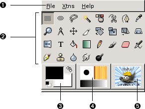
The Main Toolbox is the heart of the GIMP. It is the only part of the application that you cannot duplicate or close. Here is a quick tour of what you will find there.
![[Tip]](../images/tip.png)
|
Tip |
|---|---|
|
In the Toolbox, as in most parts of GIMP, moving the mouse on top of something and letting it rest for a moment will usually bring up a "tooltip" message that may help you understand what the thing is or what you can do with it. Also, in many cases you can press the F1 key to get help about the thing that is underneath the mouse. |
|
|
Toolbox Menu: This menu is special: it contains some commands that cannot be found in the menus that are attached to images. (Also some that can.) These include commands for setting preferences, creating certain types of dialogs, etc. The contents are described systematically in the Toolbox Menu section. |
|||
|
|
Tool icons: These icons are buttons which activate tools for a wide variety of purposes: selecting parts of images, painting on them, transforming them, etc. The Toolbox Introduction section gives an overview of how to work with tools, and each tool is described systematically in the Tools chapter. |
|||
|
|
Foreground/Background colors: The color areas here show you GIMP's current foreground and background colors, which come into play in many operations. Clicking on either one of them brings up a color selector dialog that allow you to change to a different color. Clicking on the double-headed arrow swaps the two colors, and clicking on the small symbol in the lower left corner resets them to black and white. |
|||
|
|
Brush/Pattern/Gradient The symbols here show you GIMP's current selections for: the Paintbrush, used by all tools that allow you to paint on the image ("painting" includes operations like erasing and smudging, by the way); for the Pattern, which is used in filling selected areas of an image; and for the Gradient, which comes into play whenever an operation requires a smoothly varying range of colors. Clicking on any of these symbols brings up a dialog window that allows you to change it. |
|||
|
|
Active Image: (This is a new feature in GIMP 2.2) In GIMP, you can work with many images at once, but at any given moment, one of them is the “active image”. Here you find a small iconic representation of the active image. Clicking on it brings up a dialog with a list of all the currently open images, allowing you to make a different one active if you want to. (Clicking on the window where the image is displayed will accomplish the same thing, though.)
|
|
|
Note |
|---|---|
|
At every start, GIMP selects a tool (the brush), a color, a brush and a pattern by default, always the same. If you want GIMP to select the last tool, color, brush and pattern you used when quitting your previous session, check the "Set input device settings on exit" in Preferences/Input Devices. |
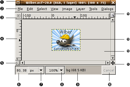
In GIMP, each image that you have open is displayed in its own separate window. (In some cases, multiple windows may all display the same image, but this is unusual.) We will begin with a brief description of the components that are present by default in an ordinary image window. Some of these, in fact, can be made to disappear using commands in the View menu; but you will probably find that you don't want to do that.
|
|
Title Bar: At the top of the image window you will probably see a emphasis bar, showing the name of the image and some basic information about it. The emphasis bar is actually provided by the windowing system, not by GIMP itself, so its appearance may vary with different operating systems, window managers, and/or themes. In the Preferences dialog you can customize the information that appears here, if you want to. |
|||
|
|
Image Menu: Directly below the emphasis bar appears the Image Menu (unless it has been suppressed). This menu gives you access to nearly every operation you can perform on an image. (There are some “global” actions that can only be accessed via the Toolbox menu.) You can also get the Image Menu by right-clicking inside the image [1] , or by left-clicking on the little “arrow” symbol in the upper left corner, if for some reason you find one of these more convenient. More: most menu operations can also be activated from the keyboard, using Alt plus an “accelerator” key underlined in the menu emphasis. More: you can define your own custom shortcuts for menu actions, if you enable Use Dynamic Keyboard Shortcuts in the Preferences dialog. |
|||
|
|
Menu Button: Clicking on this little button gives you the Image Menu, except in a column instead of a row. Mnemonics users who don't want the menu bar visible can acces to this menu by pressing the Shift-F10 key. |
|||
|
|
Ruler: In the default layout, rulers are shown above and to the left of the image, indicating coordinates within the image. You can control what type of coordinates are shown if you want to. By default, pixels are used, but you can change to other units, using the Units setting described below. One of the most important uses of rulers is to create guides. If you click on a ruler and drag into the image display, a guideline will be created, which you can use to help you position things accurately. Guides can be moved by clicking on them and dragging, or deleted by dragging them out of the image display. |
|||
|
|
QuickMask Toggle: At the lower left corner of the image display is a small button that toggles on or off the Quick Mask, which is an alternate, and often extremely useful, way of viewing the selected area within the image. For more details see QuickMask. |
|||

|
Pointer Coordinates: In the lower left corner of the window is a rectangular area used to show the current pointer coordinates (that is, the mouse location, if you are using a mouse), whenever the pointer is within the image boundaries. The units are the same as for the rulers. |
|||

|
Units menu: (This feature is new in GIMP 2.2; it does not appear in GIMP 2.0). By default, the units used for the rulers and several other purposes are pixels. You can change to inches, cm, or several other possibilities using this menu. (If you do, note that the setting of “Dot for dot” in the View menu affects how the display is scaled: see Dot for Dot for more information. |
|||

|
Zoom button: (This feature is new in GIMP 2.2; it does not appear in GIMP 2.0). There are a number of ways to zoom the image in or out, but this menu is perhaps the simplest. |
|||

|
Status Area: The Status Area appears below the image display. Most of the time, by default, it shows which part of the image is currently active, and the amount of system memory that the image is consuming. You can customize the information that appears here, by changing your Preferences. When you perform time-consuming operations, the status area changes temporarily to show what operation is being performed, and its state of progress.
|
|||

|
Cancel Button: At the lower right corner of the window appears the Cancel button. If you start a complex, time-consuming operation (most commonly a plug-in), and then decide, while it is being computed, that you didn't really want to do it after all, this button will cancel it immediately.
|
|||

|
Navigation control: This is a small cross-shaped button at the lower right corner of the image display. Clicking on it, and holding the left mouse button down, brings up a window showing a miniature view of the image, with the displayed area outlined. You can pan to a different part of the image by moving the mouse while keeping the button depressed. For large images of which only a small part is displayed, the navigation window is often the most convenient way of getting to the part of the image you are looking for. (See Navigation Dialog for other ways to access the Navigation Window). (If your mouse has a middle-button, click-drag with it to span across the image). |
|||

|
Inactive Padding Area: This padding area seperates the active image display and the inactive padding area, so you're able to distinguish between them. You cannot apply any Filters or Operations in generall on the inactive area. |
|||

|
Image Display: The most important part of the image window is, of course, the image display or canvas. It occupies the central area of the window, surrounded by a yellow dotted line showing the image boundary, against a neutral gray background. You can change the zoom level of the image display in a variety of ways, including the Zoom setting described below. |
|||

|
Image Window Resize Toggle: If this button is pressed, the image itself will be resized if the image window is resized. |
In GIMP 2.0 and 2.2, you have a lot of flexibility about the arrangement of dialog windows on your screen. Instead of placing each dialog in its own window, you can group them together using docks. A "dock" is a container window that can hold a collection of persistent dialogs, such as the Tool Options dialog, Brushes dialog, Palette dialog, etc. Docks cannot, however, hold image windows: each image always has its own separate window. They also can't hold non-persistent dialogs, such as the Preferences dialog or the New Image dialog.
Each dock has a set of docking bars, as highlighted in the adjoining figure. These are thin gray bars, very unobtrusive and easy not to notice: most people don't realize that they exist until they are specifically pointed out.
Each dockable dialog has a drag handle area, as highlighted in the figure on the right. You can recognize this by the fact that the cursor changes to a hand shape when the pointer is over the drag handle area. To dock a dialog, you simply click on its drag handle area, and drag it onto one of the docking bars in a dock: the dialog will be added to the aimed window. If you drag it onto the aimed window itself, then it will be added as a tab.
Figure 3.5. A dialog in a dock, with the drag handle area highlighted.
This screenshot shows the area that allows to take a dialog off the dock.
You can drag more than one dialog onto the same docking bar. If you do, they will turn into tabs, represented by iconic symbols at the top. Clicking on the tab handle will bring a tab to the front, so that you can interact with it.
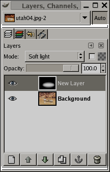
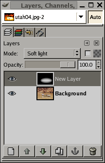
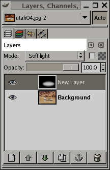
Some docks contain an Image Menu: a menu listing all of the images open in GIMP, and displaying the name of the image whose information is shown in the dock. You can use the Image Menu to select a different image (don't confuse this menu for the Image Menu that is the Menu of the active image on your screen). If the Auto button is depressed, then the menu always shows the name of GIMP's currently active image, that is, the image you are currently working on.
By default, a “Layers, Channels, and Paths” dock shows an Image Menu at the top, and other types of docks do not. You can always add or remove an Image Menu, however, using the "Show Image Menu" toggle in the Tab menu, as described below. (Exception: you cannot add an Image Menu to the dock that contains the Toolbox.)
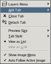
In each dialog, you can access a special menu of tab-related operations by pressing the Tab Menu button, as highlighted in the figure on the right. Exactly which commands are shown in the menu varies a bit from dialog to dialog, but they always include operations for creating new tabs, or closing or detaching tabs.
The Tab menu gives you access to the following commands:
At the top of each Tab menu is an entry that opens into the dialog's context menu, which contains operations specific to that particular type of dialog. For example, the context menu for the Patterns dialog contains a set of operations for manipulating patterns.
This entry opens into a submenu allowing you to add a large variety of dockable dialogs as new tabs.
This entry closes the dialog. Closing the last dialog in a dock causes the dock itself to close. Choosing this menu entry has the same effect as pressing the "Close Tab" button.
This entry detaches the dialog from the dock, creating a new dock with the detached dialog as its only member. It has the same effect as dragging the tab out of the dock and releasing it at a random location.
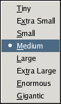
Many, but not all, dialogs have Tab menus containing a Preview Size option, which opens into a submenu giving a list of sizes for the items in the dialog (cp. Figure 3.9, “ Preview Size submenu of a Tab menu El submenú "Tamaño de la vista previa". ” ). For example, the Brushes dialog shows pictures of all available brushes: the Preview Size determines how large the pictures are. The default is Medium.
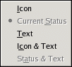
This entry is available when multiple dialogs are in the same dock: it opens into a submenu allowing you to choose how the tabs at the top will appear (cp. Figure 3.10, “ Tab Style submenu of a Tab menu ” ). There are five choices, not all of which will be available for all types of dialogs:
This choice gives you an icon representing the dialog type.
This choice is only available for dialogs that allow you to select something, such as a brush, a pattern, a gradient, etc. It gives you a tab showing a representation of the item currently selected.
This choice gives you a tab showing the dialog type in text.
This choice gives you wider tabs, containing both an icon and the type of dialog in text.
This choice, where available, shows the item currently selected, as well as the type of dialog.
These entries are shown in dialogs that allow you to select an item from a set: brushes, patterns, fonts, etc. You can choose whether to view the items as a vertical list, with the name of each beside it, or as a grid, with representations of the items but no names. Each has its advantages: viewing as a list gives you more information, but viewing as a grid allows you to see many more possibilities at once. The default for this varies across dialogs: for brushes and patterns, the default is a grid; for most other things, the default is a list.
This is a toggle. If it is checked, then an Image Menu is shown at the top of the dock. It is not available for dialogs docked below the Toolbox. Dont confuse this menu for the Image Menu, that is the menu of the active image on your screen.
This is a toggle, and it is meaningless unless an Image Menu is being shown. It causes the Image Menu, and hence the contents of the dialog if they are image-related, to change to follow whatever image you are working on at the moment. For example, if you have two images and the Histogram dialog on your secreen, then the histogram of the activated image will be displayed.